Dispatch
The visual system was rebuilt to feel calmer, richer, and more premium on mobile
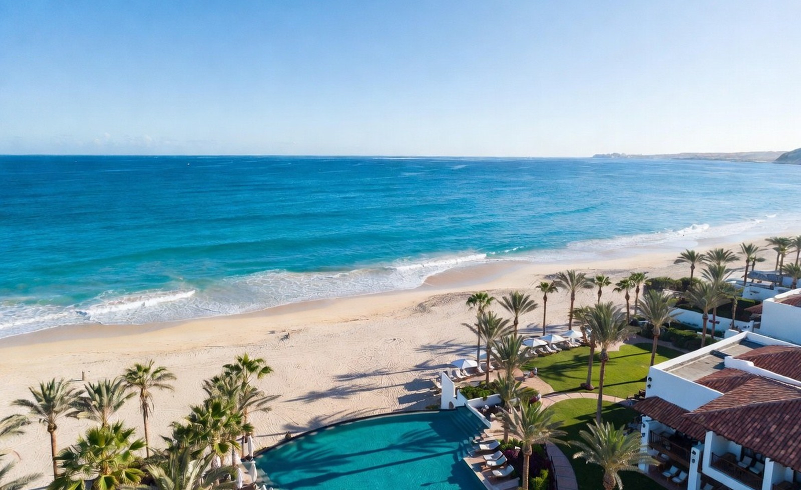
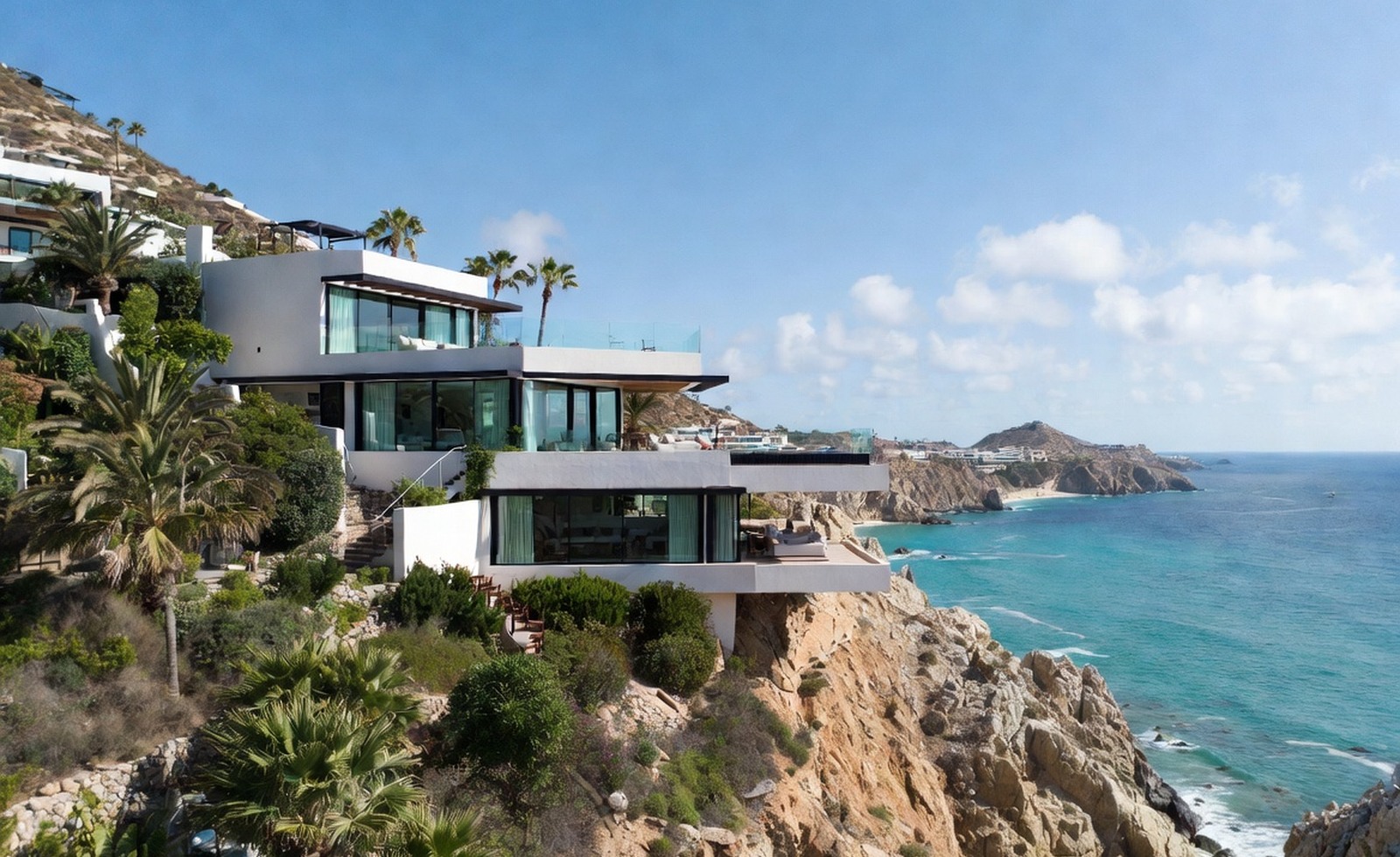
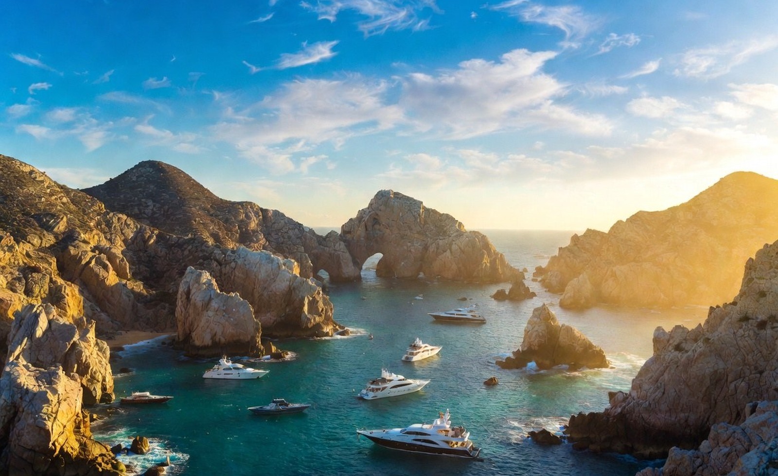
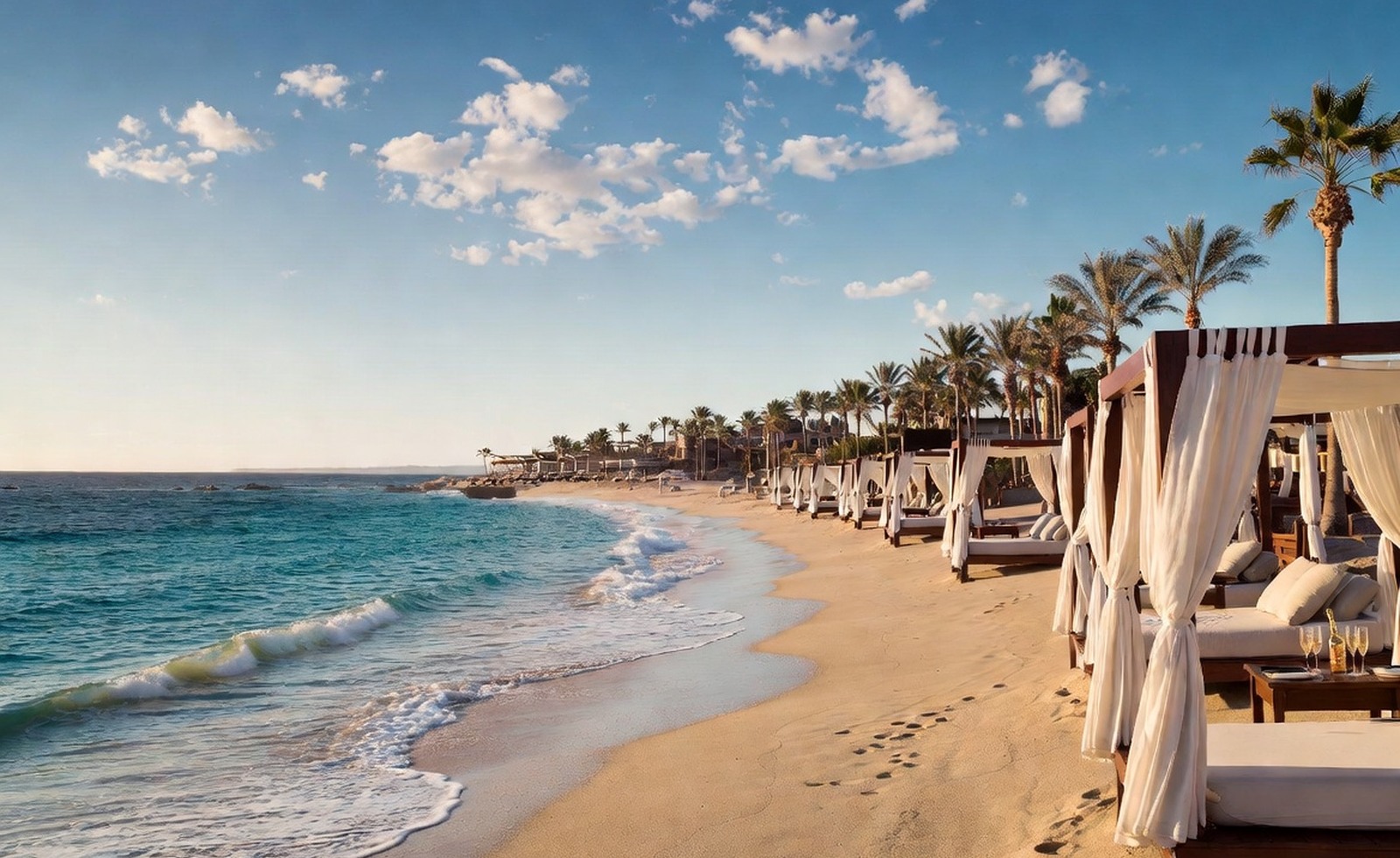
The site now uses a more distinctive luxury palette and a stronger mobile-first layout rhythm.
We rebuilt the presentation around layered gradients, warm neutrals, deep ocean tones, and a cleaner hierarchy that scales well from phone screens to desktop.
Luxury travel brands live or die on first impression, and a generic layout immediately undercuts the price point and aspiration the name is supposed to carry.
This design pass makes the whole site feel more memorable, easier to scan, and more emotionally aligned with premium travel.
Taken together, these dispatches show how design system shaped the feel of PlushVacation.com over time, from the way the pages read to how the brand presents itself at a glance.